
Member Education
Helping members confidently navigate complex healthcare tools through step-by-step guidance.

Health insurance websites and mobile apps offer dozens of self-service features, from finding care and accessing ID cards to viewing claims and managing benefits. For many members, knowing how to complete these tasks can be just as challenging as the tasks themselves.
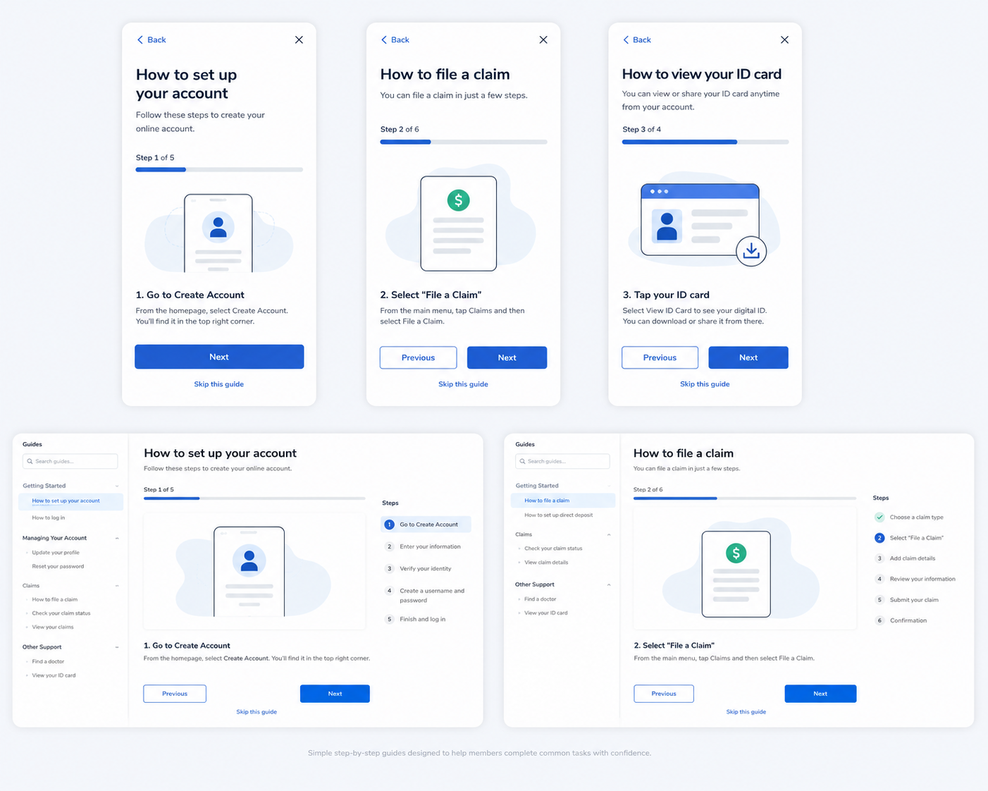
I designed a library of guided walkthroughs that provided clear, step-by-step instructions to help members successfully navigate key digital experiences across web and mobile.
The solution supported multiple lines of business—including Commercial, Medicare, and Medicaid—and required content that was simple enough for a broad range of health literacy and digital literacy levels.
Overview

The Challenge
Members came to the experience with different healthcare knowledge, technical skills, and benefit structures.
The guidance needed to:
Support multiple lines of business with unique experiences
Explain complex healthcare tasks in everyday language
Work across both web and mobile platforms
Maintain consistency across hundreds of screens
Remain easy to update as products evolved
Every guide needed to be accurate, accessible, and immediately actionable.

My Role: Lead Content Strategist
I partnered with product, content, engineering, accessibility, and business stakeholders to:
Design a scalable guidance experience
Create reusable content patterns
Develop step-by-step user flows
Write instructional content
Review experiences across multiple product lines
Ensure accessibility and readability standards were met

Design Approach
Writing for Everyone
Healthcare terminology can quickly become overwhelming, particularly for members with limited health or digital literacy.
I translated complex workflows into concise, approachable instructions using plain-language principles, targeting approximately a fourth-grade reading level while preserving accuracy and regulatory requirements.
Breaking Down Complex Tasks
Rather than presenting large blocks of information, I divided tasks into clear, manageable steps that helped members complete actions with confidence.
Each guide focused on:
One task at a time
Simple, action-oriented language
Clear visual hierarchy
Predictable navigation
Reduced cognitive load
Designing at Scale
The guidance system supported experiences across Commercial, Medicare, and Medicaid products, requiring patterns that could adapt to different member journeys while remaining familiar and consistent.
I established reusable structures and content patterns that made future guides easier to create and maintain.
Collaboration
Because the guidance reflected live product experiences, I worked closely with product managers, engineers, accessibility specialists, and business stakeholders to ensure every guide accurately represented the member experience while remaining easy to understand.

Outcome
The resulting guidance library provided members with an approachable way to complete common healthcare tasks independently, reducing confusion and creating a more consistent support experience across multiple digital products and lines of business.
By combining thoughtful UX writing, structured information architecture, and accessible content design, the experience helped make complex healthcare tools feel significantly easier to navigate.
Highlights
Designed a scalable library of step-by-step member guides
Simplified complex healthcare tasks using plain-language content
Supported Commercial, Medicare, and Medicaid experiences
Designed for both web and mobile platforms
Applied health literacy and accessibility best practices throughout
Created reusable patterns for future guidance content