
Health Assessment Experience
Redesigning a required health assessment to improve comprehension, accessibility, and completion.

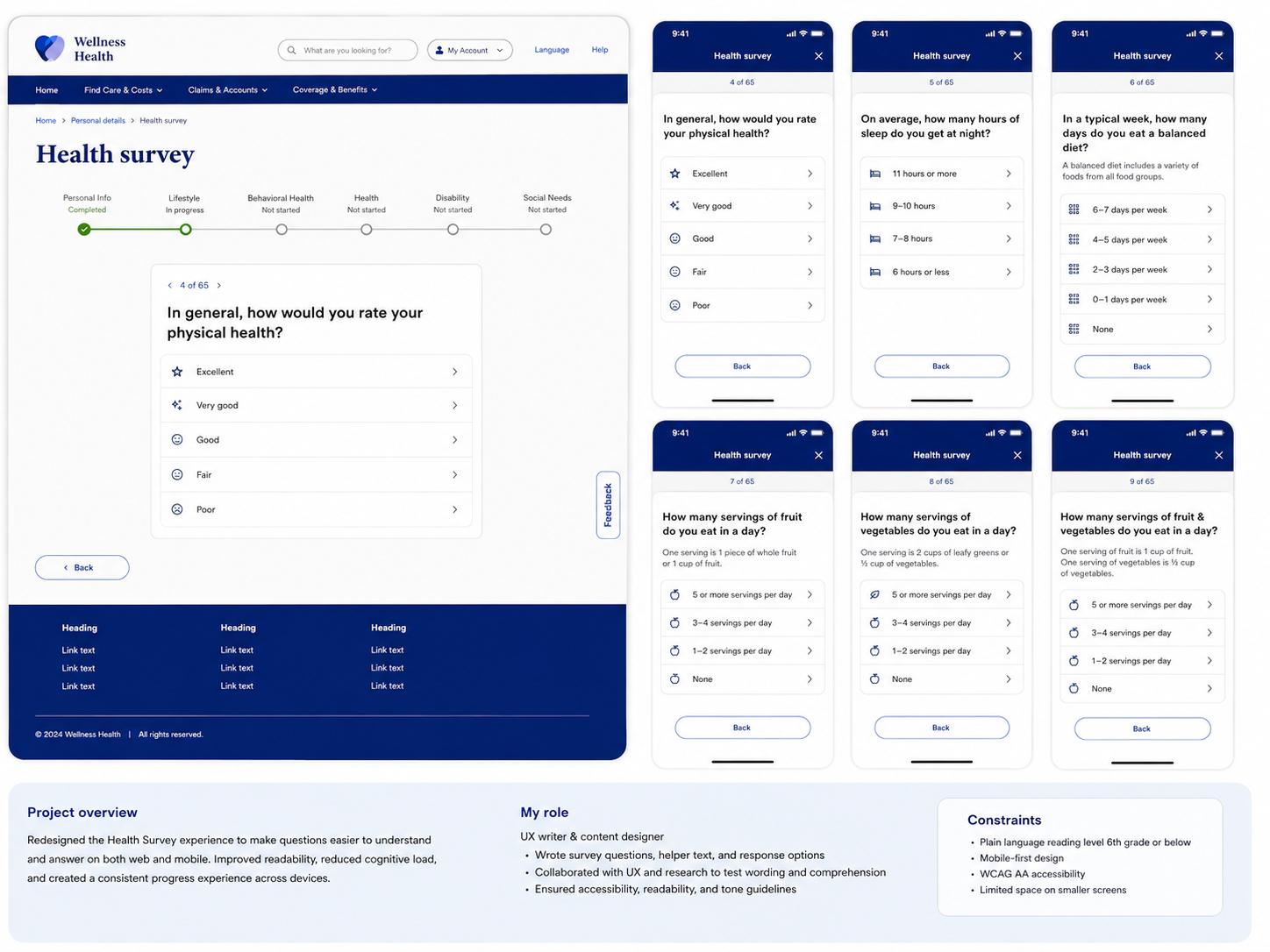
A national health insurer required members to complete a comprehensive health assessment consisting of approximately 65 questions. While the assessment itself was mandatory and the majority of questions were fixed by business and regulatory requirements, the experience presented an opportunity to reduce friction through thoughtful UX design.
I partnered with product, UX research, content strategy, legal, governance, and accessibility teams to transform a static questionnaire into a dynamic, member-centered experience that balanced compliance with usability.
Overview
The Challenge
Unlike many digital experiences, success wasn't about reducing the number of questions. Every required question served a purpose—from identifying health risks to supporting preventive care recommendations.
The challenge was designing an experience that felt approachable despite its length by:
Improving health literacy through plain-language content
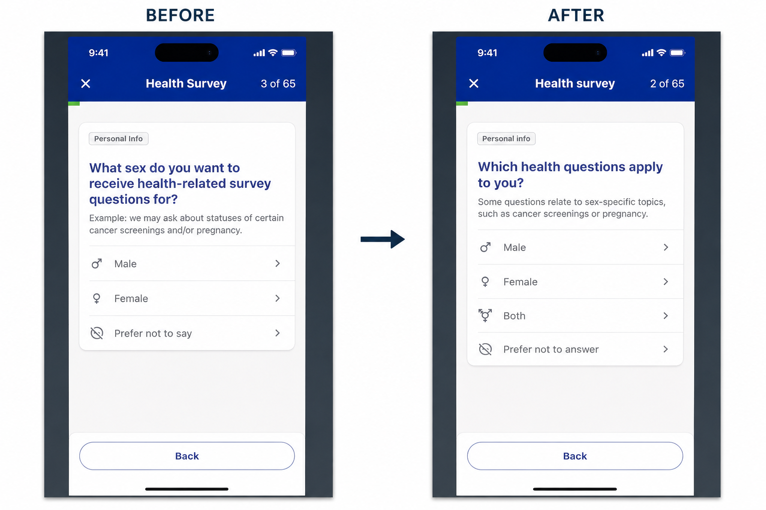
Asking sensitive health questions with empathy and clarity
Creating logical question flows using dynamic branching
Maintaining consistency across dozens of screens
Meeting accessibility standards for members with varying abilities
Preserving legal and regulatory requirements without sacrificing usability

My Role: Lead Content Designer
UX and interaction design
Content optimization and health literacy improvements
Accessibility reviews and design refinements
Cross-functional collaboration with product, legal, governance, and engineering
Design documentation and implementation support

Design Approach
Rather than focusing on reducing the survey itself, I focused on reducing the effort required to complete it.
Plain Language
Many questions involved complex medical terminology or insurance language. I rewrote content using plain language principles while preserving the intent and meaning required by stakeholders.
Sensitive Question Design
Health assessments naturally ask personal questions. I worked to ensure every question felt respectful, unbiased, and easy to answer by refining wording, response options, and supporting content.
Dynamic Survey Logic
Instead of presenting every question to every member, the experience adapted based on previous responses, surfacing only the most relevant follow-up questions and creating a more personalized flow.
Accessibility
Accessibility was considered throughout the design process, including:
Clear visual hierarchy
Readable typography and contrast
Consistent interaction patterns
Screen reader-friendly structure
Accessible form controls and error handling
Cross-functional Collaboration
Because the assessment touched multiple regulated areas, every iteration required close collaboration across UX, product, legal, governance, accessibility, and engineering teams to balance compliance with usability.

Outcome
The redesigned experience established a scalable foundation for future health assessments by introducing dynamic survey logic, improving content clarity, and creating a more accessible, consistent experience for members.
While the assessment remained comprehensive, the redesign helped make a complex, compliance-driven process feel more approachable and easier to complete.